Visualizing List Comparisons: How to Unlock Powerful Data Insights
Discover how visual list comparison tools can transform your data analysis experience. Learn how our interactive visualizations help you quickly understand differences between lists and make better decisions.
When working with data, comparing two lists is one of the most common yet challenging tasks. Whether you're analyzing customer segments, tracking inventory, or monitoring changes in datasets, understanding the differences and similarities between lists is crucial. But traditional text-based comparisons can be overwhelming and difficult to interpret quickly.
The Power of Visual List Comparisons
Visual representations of list comparisons transform raw data into meaningful insights. Our platform's visualization features make it remarkably easy to understand the relationship between your lists at a glance.
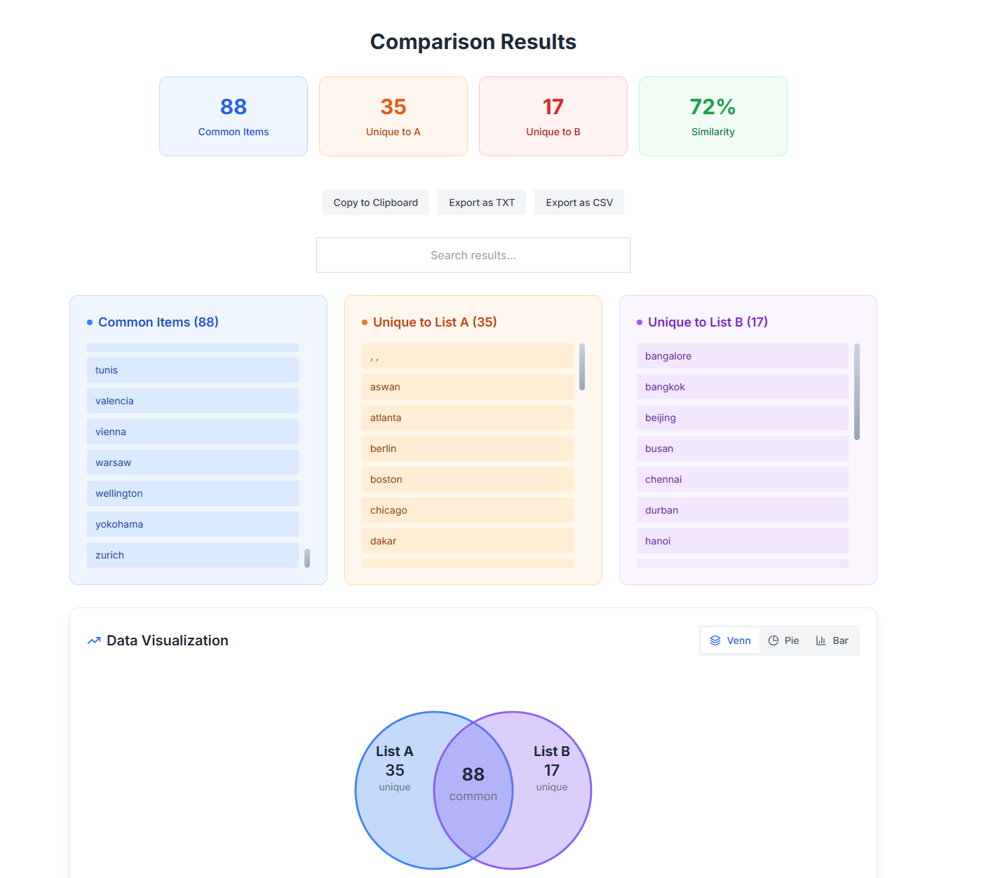
As shown above, our comparison results provide a clear, intuitive breakdown of your data:
- Common Items (88): Items that appear in both lists are immediately visible
- Unique to List A (35): Items that only appear in your first list
- Unique to List B (17): Items that only appear in your second list
- Similarity Percentage (72%): A quick measure of how similar your lists are
This visual approach offers several significant advantages over traditional text-only comparisons.
Benefits of Visualized List Comparisons
1. Instant Understanding
With visual list comparisons, you don't need to scan through hundreds of rows to understand your data. The color-coded sections and numerical summaries provide immediate insights into how your lists relate to each other.
2. Better Pattern Recognition
The human brain processes visual information much faster than text. Our visualization tools leverage this by presenting data in formats that make patterns and outliers immediately apparent.
3. Improved Decision Making
When you can clearly see the overlap and differences between lists, you can make more informed decisions. Whether you're deciding which customers to target with a campaign or which inventory items need restocking, visual comparisons provide the clarity you need.
4. Easier Communication
Sharing insights with team members or stakeholders becomes much simpler with visual representations. Instead of explaining complex data relationships verbally, you can point to a clear visual that everyone can understand.
Practical Applications
Our visual comparison tools are helping professionals across various fields:
Data Analysis
Analysts use our visualization tools to quickly identify data discrepancies and track changes over time. The ability to see common elements and unique items at a glance speeds up analysis workflows significantly.
Inventory Management
Retail businesses compare current inventory against previous periods to identify fast-moving items and potential stockouts. The visual format makes it easy to spot trends that might be missed in spreadsheets.
Customer Relationship Management
Marketing teams compare customer lists from different campaigns to understand audience overlap and identify high-value segments. The similarity percentage helps quantify campaign effectiveness.
Project Management
Teams track task completion by comparing current project status against planned milestones. Visual comparisons make it easy to identify areas that need attention.
Advanced Visualization Features
Beyond the basic comparison view, our platform offers additional visualization options:
Interactive Venn Diagrams
The interactive Venn diagram at the bottom of the comparison results provides a classic yet powerful way to visualize set relationships. This familiar format helps users intuitively grasp the relationship between their lists.
Searchable Results
The search functionality allows you to quickly find specific items within your comparison results, making it easy to locate particular entries even in large datasets.
Export Options
After visualizing your comparison, you can export the results in various formats (TXT, CSV) for further analysis or sharing with team members.
Getting Started with Visual List Comparisons
Using our visualization tools is straightforward:
- Enter or upload your two lists
- Click "Compare"
- Instantly view your visual comparison results
- Search, filter, or export as needed
There's no complicated setup or learning curve—just immediate visual insights into your data.
Experience the Difference
If you've been struggling with traditional methods of comparing lists, our visual comparison tools can transform your workflow. The clarity and immediacy of visual representations can save hours of analysis time and help you discover insights you might otherwise miss.
We invite you to try our list comparison tools and experience the power of visualization for yourself. Whether you're working with small datasets or large collections, our platform makes it easy to understand the relationships between your lists and make better-informed decisions.
Ready to transform how you compare data? Give our list comparison tool a try today and see the difference visualization can make.
Tags
Related Articles
Compare Instagram Follower Lists - Track Growth & Engagement
Discover how to effectively track Instagram followers and unfollowers using professional list comparison tools. Learn to compare two lists of followers, analyze engagement patterns, and optimize your social media strategy.
Multi-List Comparison Tool: Compare Up to 10 Lists Simultaneously for Advanced Data Analysis
Discover our new multi-list comparison feature that lets you compare up to 10 lists at once. Perfect for social media managers, data analysts, and businesses who need to analyze complex relationships between multiple datasets.
Excel vs List Comparison Tools - Why Analysts Switch
A data analyst shares real experiences about abandoning Excel for list comparison tasks. Discover why smart comparison tools outperform traditional methods and save hours of manual work.